7 Mistakes You’re Making with Your Brand Identity Design (and How to Fix Them)
If people don’t understand what you do at a glance, they won’t choose you. Your brand identity design is often the first conversation you have with a potential client, and if that conversation is confusing, cluttered, or inconsistent, you’re losing money before you even get a chance to pitch.
Many businesses treat branding as a “one-and-done” task, something to check off a list so they can get back to operations. But a weak visual identity does more than just look “off.” It actively erodes trust. In fact, research shows that brand consistency can increase revenue by up to 23%, yet many companies continue to make avoidable errors that keep them invisible to their target market.
Let’s explore the seven most common mistakes businesses make with their brand identity design and, more importantly, how you can fix them to drive growth and visibility.
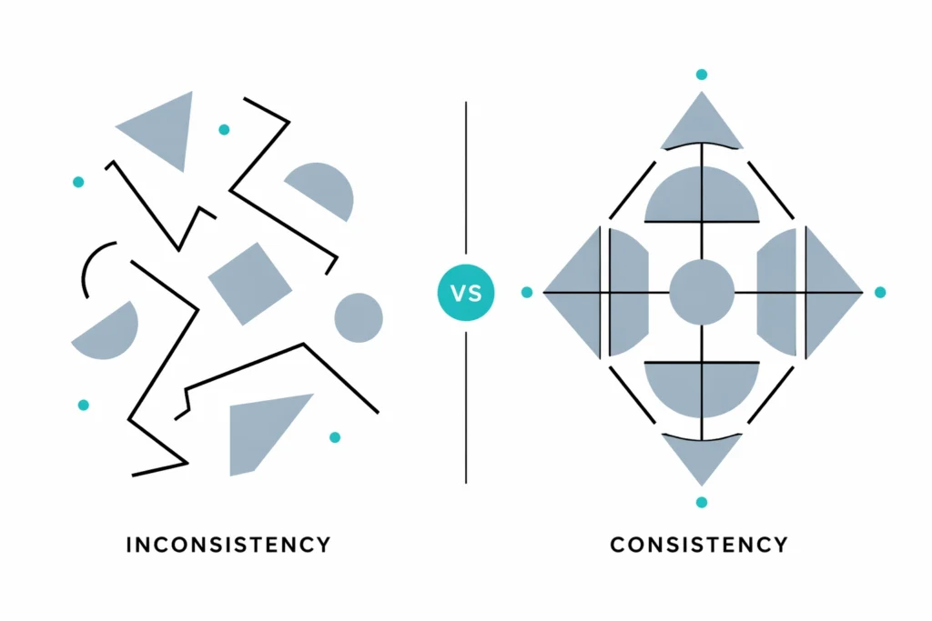
1. The Inconsistency Trap
The biggest mistake is having a “fragmented” brand. This happens when your LinkedIn profile looks different from your website, which looks different from your printed proposals. When your colors, fonts, and logo usage vary across platforms, you look unprofessional and disorganized.
The Reframe: Consistency isn’t about being repetitive; it’s about being recognizable. If a customer sees your post on Instagram and then visits your website, the transition should feel seamless.
The Fix: Audit every single touchpoint. Ensure your logo is the same version everywhere and your color palette is strictly followed. If you’re struggling to keep track, it’s time to revisit your core branding elements.
2. Designing for Yourself, Not Your Audience
It’s easy to choose a color because it’s your favorite or a font because you think it looks “cool.” However, your brand identity isn’t a reflection of your personal taste, it’s a tool to attract a specific type of person. If you’re a high-end law firm but use “trendy” neon colors, you’re alienating the very people who want to hire you for your stability.
The Reframe: Your brand is a bridge between your service and your customer’s needs. If the bridge doesn’t look like something they want to cross, they won’t.
The Fix: Conduct formal audience research. Identify the demographic you want to reach and study the visual cues they associate with trust and authority in your industry. For example, construction marketing requires a very different visual language than luxury hospitality.

3. Overcomplicating the Visuals
A busy logo with four different fonts, a complex illustration, and five colors is a disaster for brand recall. Data suggests that complex logos decrease brand recall by 40%. If your audience has to squint or think too hard to understand your mark, they’ll simply forget it.
The Reframe: In design, less is almost always more. Simplicity scales. It works on a billboard and it works on a favicon.
The Fix: Limit your brand to two fonts maximum and three core colors. Strip away any unnecessary decorative elements from your logo. Focus on a single, strong visual idea that communicates your core value.

4. Chasing Short-Term Trends
Every few years, a specific design trend takes over the internet, think “minimalist beige” or “brutalist typography.” While these look great in the moment, they date quickly. If your brand identity is built solely on a trend, you’ll be forced to undergo an expensive rebrand in twenty-four months just to stay relevant.
The Reframe: Your brand should be built on your values, not on what’s popular on Pinterest this week. Values are timeless; trends are temporary.
The Fix: Look for timeless design principles. Choose palettes and typography that reflect your company’s personality. If you’re a bold, innovative agency, use bold shapes, but do it in a way that feels intentional, not just “on-trend.”
5. Neglecting Typography and Color Psychology
Typography and color aren’t just aesthetic choices; they are psychological triggers. Blue conveys trust and stability, while red signals urgency and passion. Similarly, a serif font feels traditional and academic, while a sans-serif feels modern and tech-forward. Many businesses pick these at random, sending mixed signals to their market.
The Reframe: Every visual choice is a communication choice. Ensure your “visual dialect” matches your “verbal message.”
The Fix: Research color psychology before finalizing your palette. Choose a primary typeface that is highly readable across all platforms. Ensure there is enough contrast between your text and background to maintain accessibility.
6. Forgetting Mobile and Digital Scalability
Your brand identity might look stunning on a large desktop monitor, but how does it look on a smartphone screen? Or as a tiny social media profile picture? Many brands use intricate logos that turn into an unrecognizable “blob” when scaled down, which kills your professional appearance in the digital space.
The Reframe: Your brand lives in a digital-first world. If it doesn’t work on a five-inch screen, it doesn’t work.
The Fix: Test your logo at various sizes. Create a “responsive” version of your logo, often called a brand mark or favicon, that is simplified for small-scale use. Ensure your website and marketing materials use a layout that prioritizes mobile readability.
7. Operating Without a Brand Style Guide
The most common reason for all the mistakes above is the lack of a Brand Style Guide. Without a central “source of truth,” every new employee or freelancer you hire will interpret your brand differently. This leads to the inconsistency mentioned in point one and eventually dilutes your market position.
The Reframe: A style guide is not a restriction; it’s a manual for growth. It ensures that as you scale, your brand stays intact.
The Fix: Create a comprehensive Brand Style Guide that includes your logo usage rules, color codes (HEX, RGB, CMYK), typography hierarchy, and tone of voice. This document should be given to anyone creating content for your business.
Building a Brand That Lasts
Correcting these mistakes isn’t just about “cleaning up” your look, it’s about positioning your business for the next level of opportunity. When your brand identity design is strategic, clear, and consistent, you stop chasing leads and start attracting them.
At Freeform PR & Branding, we specialize in helping businesses move past generic design and toward a brand that actually moves the needle. Whether you need a complete overhaul or a strategic refinement, our branding solutions are designed to elevate your presence and ensure you’re never “just another company” in the crowd.
Take a look at your current brand identity. Does it tell the story you want to be known for? If the answer isn’t a confident “yes,” it’s time to start fixing those mistakes.